Designing with Block Kit
It's important to consider accessibility when designing your app.
Accessibility in your apps means ensuring users with disabilities can understand, navigate, and interact with them effectively. And it benefits everyone! Consider that everyone at some point in life will experience a disability, whether it be permanent, temporary, or situational (think "I sat on my glasses and can't quite see today"). Building your apps in an accessible way will make the world a better place.
Here are our tips and recommendations for how to make your apps accessible when using Block Kit to compose your app's surfaces.
Keep content clear and concise
Here are some general guidelines for content in Slack apps.
Do:
- Use short, clear sentences and paragraphs.
- Explain abbreviations.
Don't:
- Use jargon, buzzwords, idioms, and slang; be fun but don't alienate anyone.
- Use directional and sensory language, including emojis. For example, do not use an arrow to refer to a prior message.
Use color carefully
There are two main rules around the use of color:
-
Use more than just color to convey meaning. Color can enhance and reinforce meaning, but it should not be the only way to convey meaning. Say, for instance, you'd like to have a button to cancel a subscription. A red button that says "cancel" would not be sufficient because "cancel" is used in many contexts that are not a severe action. Instead, the button should read "cancel subscription" to fully convey the meaning of the action.
-
Provide sufficient contrast for text and important visual indicators. The ideal contrast ratio is 4.5:1 for regular text, though we at Slack mostly control this so you don't need to worry about it. However, it's always a good idea to test your apps in both light and dark mode to ensure usability in both.
Simplify with pictures
Sometimes faces can be better than names, or maps better than addresses. Sprinkle image elements into blocks to remove some of that text.
This message is okay:

But this version is easier to parse, without losing any vital information:

Use interactivity to reduce complexity
Use interactive components to break workflows into steps, and only show what’s needed for the current step. Let interaction choices reveal further information or options only when they’re necessary.
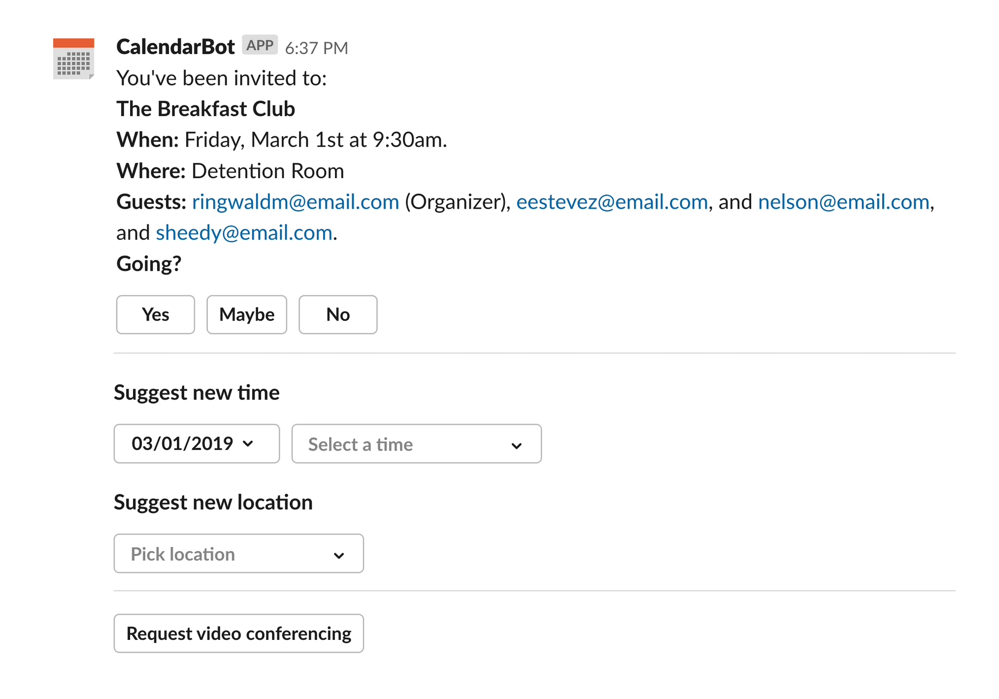
For example, this calendar app has a lot of information and interactive options to display:
But it could achieve the same functionality by keeping advanced options tucked away until they're needed. Here's the same app using context blocks to better organize info, and an overflow menu to store lesser-used options:
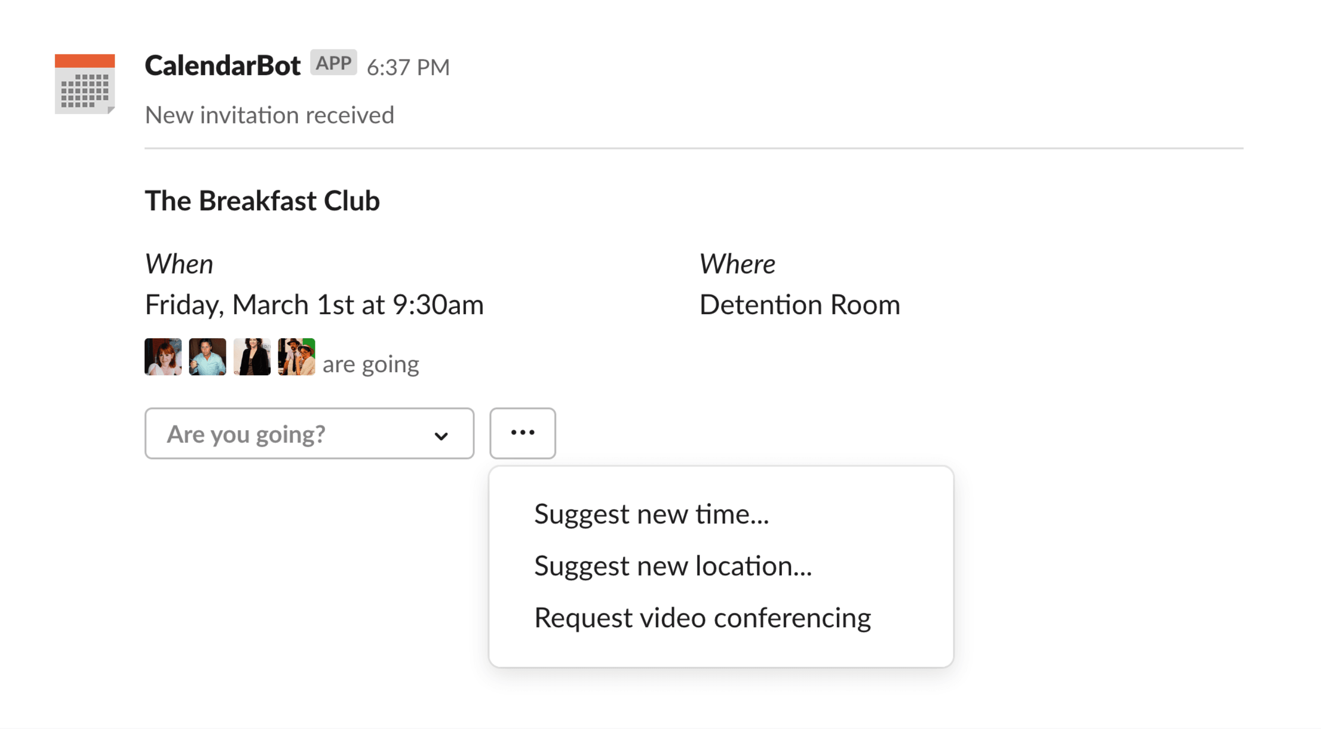
By streamlining the default interactivity, you're helping your users intuit the most important action to take on the message.
Choose sensible default options
Save people work wherever you can by minimizing the choices they have to make. When you give select menus and buttons good default values, you decrease the number of choices they have to make from many to one - yes or no.
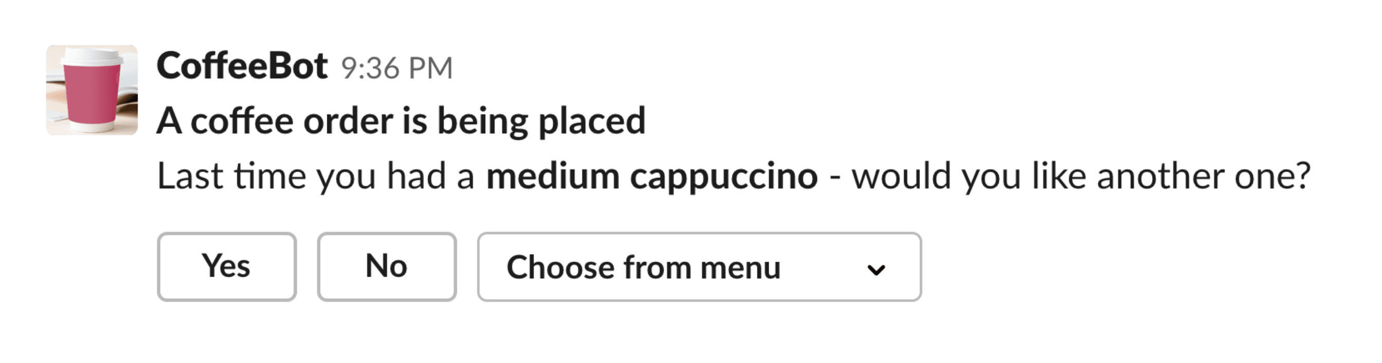
Say your app helps people buy coffee. Instead of presenting a full menu of choices every time someone orders, you could make the user’s last order the default option. In the best case scenario, this reduces the coffee order to a single click.
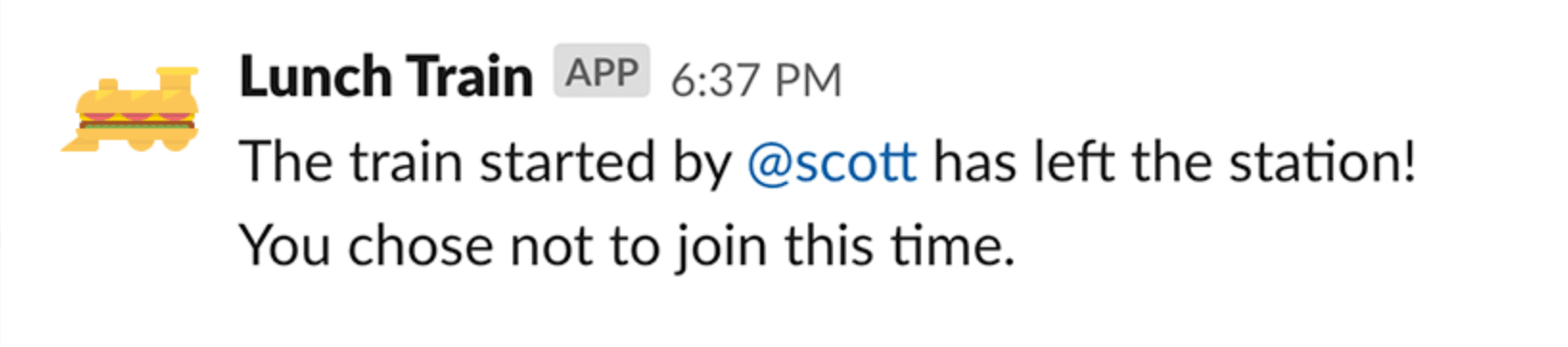
Cleaning up after your app
Visually rich messages are great in the moment you receive them: they’re nice to read and understandable to interact with. They also take up a lot of space on a person’s screen:
Think about what a person will need to remember about their interaction with your app when they come back to it later, at the end of the message’s life—or after an exchange of several messages. Do those buttons and menus need to stick around, or can you condense the message down to a short text record of what happened?
Be considerate and update your message after the interactive flow or the conversation expires:
Screen reader considerations
A screen reader is a tool used that helps people who have difficulties seeing with accessing and interacting with digital content. There are several considerations to keep in mind to most effectively work with a screen reader, including emoji use, images, and interactive elements.
Emoji use 😄
Emojis are tied to text aliases, which display on hover and when emojis are turned off. Text aliases also act as the accessible name for the emoji. A screen reader user will hear “[alias] emoji” when they read an emoji. There is no way to indicate that an emoji is decorative or add an ARIA (Accessible Rich Internet Applications) label to an emoji to describe it better. Also, organizations and end users have the ability to turn off emojis and default to the alias as plain text. Knowing this, here are some tips:
- Do not use an emoji as a control. Do not use them for field labels or inline help, in a button, or to trigger a workflow. Always pair emojis with text.
- Always the grand finale. Ideal emoji placement is at the end of a sentence or line; this improves readability.
- Just a sprinkle. Use emojis sparingly in headers and append them to the end. We recommend using emojis either in the header or the subtext, but not both.
- Emojis are not word replacements. Ensure they are paired with relevant text.
- Avoid using emojis as bullet points. You can talk about them in bulleted lists, just don't make them the bullets themselves.
Images
Guidelines regarding images in Slack apps are:
- Describe your images. Provide clear, context-specific
alt_textfor all images, and if appropriate, atitletoo. - Save the gallery wall for your stairway. Limit the number of redundant and purely decorative images in your apps. Because each image requires
alt_text, and each will be read by a screen reader, the experience could get messy with too many extraneous images.
Animations
Keep in mind that users can turn off animated gifs and emojis in their Slack accessibility preferences, so for every informational animation you have, ensure its meaning is conveyed even when paused. Either the freeze frame or the animation's surrounding text should capture the main point. Like images, always include descriptive alt_text.
Do not add more than three large flashes per second in animations. This is a WCAG (Web Content Accessibility Guidelines) standard.
Charts
Every chart that an app visually displays needs an accompanying accessible PDF. Include:
- An image block containing a chart screenshot with brief
alt_text, e.g. “chart preview”. - A button allowing the user to download the chart as an accessible PDF.
- An accessible PDF in PDF/UA format containing a properly-tagged table version of the data displayed visually in the chart screenshot.
Interactive elements
Input fields
Do:
- Wrap inputs in input blocks.
- Be a good host and provide associated labels for all inputs fields, so all users are clear on what information to enter where.
- Use descriptive placeholder text for selects.
Don't:
- Wrap inputs in section or action blocks.
- Use emojis in input labels.
Repetitive controls in lists
To ensure the best experience for your users, we recommend you:
- Give buttons brief, repetitive labels to avoid truncation.
- Make placeholder text for inputs record-specific where possible.
If you get a little wordy with your button and/or placeholder text such that Block Kit truncates the text, know that a screen reader will still read the entire placeholder text, but the button text will be cut off, so prioritize brevity on those buttons!